Digital Edition Software: Choosing the Middle Ground
Just about everybody in the publishing industry has a digital version of their magazine online. The range of products goes from National Geographic and Wired magazine’s very interactive versions to the simple pdf print replicas used by most smaller publishers. The perception is that interactive digital editions are only for the big boys and to an extent, this is true. If you want to go interactive, there is a good chance that you are talking about big money, either for the software to create and distribute it, or the time it takes to create it. Almost all of the large publishers have the programming staff necessary to bring interactive digital editions to life.
The Middle Ground
There is still a middle ground that even small publishers should seek when building their digital editions and that is they should make ‘readability’ a top priority. Most readers can do without the fancy special effects, but they want to be able to read the digital edition, and the final product resulting from uploading your print version to the web without re-sizing pages is inherently flawed. Most of the ads will be quite legible, but the editorial fonts won’t be readable without using a pinch and zoom function. Nobody wants to “pinch and zoom” their way through a magazine.
Resize Your Pages And Make It Readable
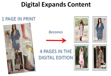
My recommendation, if you are a small to medium size publisher, is to not go to the expense of making your entire publication interactive, but rather focus on resizing your editorial pages to make your print product look great in a digital edition format. Take a look at the following example here. This was done using Digital Studio which is a pagination product, digital edition creator and a distribution channel (on it’s own newsstand, Apple newsstand and Android newsstands). We noticed that the magazine’s ads were mostly in large fonts, and there was no need to re-create all of the ads to make the digital edition look good. They could run in the print size and still be readable. Instead, Gold Coast magazine focused on re-designing and expanding their editorial pages. It actually is quite quick to do this if your designer knows they are going to be expanding the version after the print is done. It takes Gold Coast’s designer an average of 3 to 4 days per issue to re-design and expand the editorial pages so they can be read easily in the digital version. The upside is not just a digital version which is highly readable, but also a chance to run small photos at much larger sizes as in this example:
Bring Your Digital Editions To Life
Freed from the restrictions of print page costs, you can design (or in this case re-design) a better editorial product. If you are like most small and medium size publishers, this is the way to go. Don’t just slap up your print version creating a product that many just aren’t going to read. Instead, re-design the pages in In Design and focus on readability rather than interactivity. Most readers just want to be able to read your product, and many are often just plain annoyed by interactive ads anyway. This is a cost effective way to bring your digital editions to life, and give your reader a format and reading option which is actually a better experience than print.